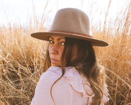
Personal Background: Emily Blincoe is a photographer she was born and raised in Austin, Texas. You can find her wandering Austin or Nashville. She takes inspiration from almost anything, but mostly the small quiet things bring her inspiration. She's currently 36 and has a dog named Eleanor. Her photography is mostly known for her interesting arrangements that bring a wide variety of colors and interest. She has many clients some of which are HP, Samsung, Aeropostale, and many more.
Style: She uses bright and natural colors that are arranged differently. Most of them draw your attention and satisfy you with the overall way the picture is laid out. She often times likes to group things in her picture by shape or sometimes by gradient. Most of her pictures use more than one color and those similar colors are grouped together. Most of the items she takes photos of are all natural. In some of her works she even spells words with flowers. Overall her work gives you a kind of relaxed and calmness from her photos, because of how she spends the time to arrange them.
Philosophy: Emily's philosophy behind many of her arrangements is mostly social. To her its really what ever she wants to take a picture of. She likes using her imagination and anything that she thinks of she goes through the effort of making and taking a picture. But recently she's been waiting for her inspiration to hit her to find something to take a picture of. She began the whole arrangements just randomly by taking things from her house. She finds much of her inspiration from nature and people. So she might be trying to promote how pretty the world is through the colorful arrangements of her photos.
Influence: In my own work I have indeed been influenced by the arrangements from Emily. Mostly her way of bringing interesting colors into the picture and arranging them in a neat way. Her photos have also given me a new look on how I should arrange things and what colors I should use to me it is very interesting how she forms a gradient of colors out of almost nothing. But I think that most importantly she has got me to take more interest in photos of nature. Her pictures showed that while many people take pictures of nature. You can do the same, but you can make your picture more interesting by having arranged them. So that your picture don't look like everyone else's, as well as it brings a certain uniqueness to your photos. Things that influence her are her dog. But for most of the things it's her own imagination, and people and nature that she sees when she walks around.
Photo Sources: http://www.emilyblincoe.com/arrangements/aonc9aj7cqqi2vz9heim2hiv3soxzo
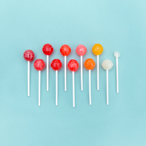
Sugar RUUUSHHH
|
Golden Arches
|
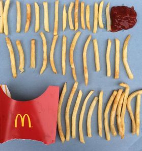
Hot Like Fire
|
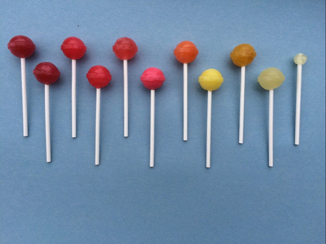
Compare and Contrast: The first image of the Dum Dums was the easiest by far but I think that I messed up the colors. It was a little hard to try and find the exact colors that I needed. I also got the wrong color of paper to take the photo on which was unfortunate. But I think that the biggest issue was the lighting I didn't get as much natural light as I wanted. So the picture looked even darker than it needed to be. I also messed up the spacing between the individual dum dums. But I think in general the picture looks somewhat similar and I had the most fun doing this photo.
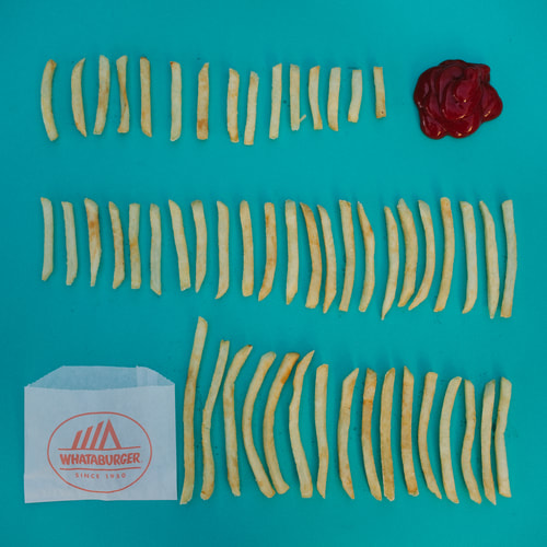
The second image of fries. I liked this image it was my second favorite and I think I did a good job on it. But there was no possible way for me to get the exact same shape and everything of the fries. I was also unhappy because there is no whattaburger here in Michigan since it turns out that's a southern chain. Again I got the color of the paper wrong and the fries were more neatly arranged in her photo. I think that this was my second best photo and it was fun to play with food.
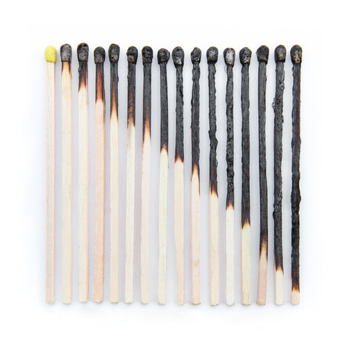
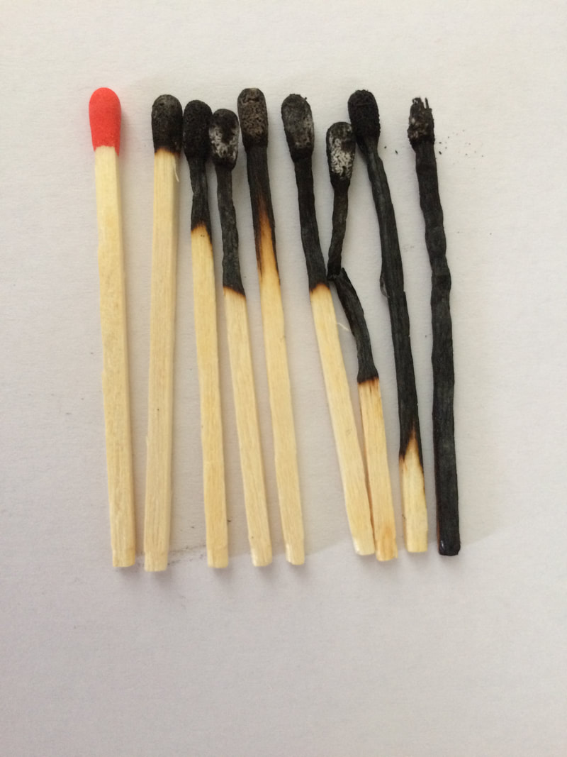
The third and final image was the matches one. This was by far the hardest photo that I had to imitate. Firstly I needed 16 matches and I needed to make them look like each one was burning more and more. Firstly I knew this was gonna be hard because I was gonna burn myself. But I struggled because the matches wouldn't burn nearly as long as they needed to. So I had to burn each one separately with a lighter which resulted in several burns. As well I could not do nearly as well as she had don in her photo. I didn't get nearly as many matches as I needed so mine looks mush smaller. Also it just doesn't look as neat as hers. So as a result I would never want to take a photo like this again because of the precision that is needed that I just couldn't do.
The second image of fries. I liked this image it was my second favorite and I think I did a good job on it. But there was no possible way for me to get the exact same shape and everything of the fries. I was also unhappy because there is no whattaburger here in Michigan since it turns out that's a southern chain. Again I got the color of the paper wrong and the fries were more neatly arranged in her photo. I think that this was my second best photo and it was fun to play with food.
The third and final image was the matches one. This was by far the hardest photo that I had to imitate. Firstly I needed 16 matches and I needed to make them look like each one was burning more and more. Firstly I knew this was gonna be hard because I was gonna burn myself. But I struggled because the matches wouldn't burn nearly as long as they needed to. So I had to burn each one separately with a lighter which resulted in several burns. As well I could not do nearly as well as she had don in her photo. I didn't get nearly as many matches as I needed so mine looks mush smaller. Also it just doesn't look as neat as hers. So as a result I would never want to take a photo like this again because of the precision that is needed that I just couldn't do.
Personal Artist Statement: The images that I took are imitations of Emily's photos. So with my work I tried to focus on portraying the same feelings from my photos as you would feel from some of her own photos. So I tried to keep it simple and very calm and happy. I think I ended up not succeeding and showing some more sadder feelings. As well I think that I didn't crop the images as well as she did and the lighting of my whole project was off. But I do feel that I captured some of what she is trying to say through her work and for that I think I did well in an imitation of her work.
Sources:
https://www.ignant.com/2014/08/20/color-coded-photography-by-emily-blincoe/
http://www.emilyblincoe.com/faq/
http://www.emilyblincoe.com/about/
http://illusion.scene360.com/art/80468/emily-blincoe/
https://www.ignant.com/2014/08/20/color-coded-photography-by-emily-blincoe/
http://www.emilyblincoe.com/faq/
http://www.emilyblincoe.com/about/
http://illusion.scene360.com/art/80468/emily-blincoe/
